CHIRTS FAQ
Contents
How CHIRTs is generated
Intro
Thermal IR satellites image the earth constantly and the data are spatially and temporally aggregated, and released as "B1" worldwide IR temperature data at 0, 3, 6, 9, 12, 15, 18, and 21 UTC hours. These satellites sense brightness temperature (Tb) from whatever surfaces are nearest to the satellite in the pixel. Land in Africa will measure on the order of 280-330 K. If there is a cloud over the pixel then the cloud top temperature will be reported, on the order of 220K. Mixtures of clouds and land will result in a mixed reported temperature. While cloudy days are generally cooler than sunny days, clouds can be ephemeral. If a high cloud happens to influence the temperature of a pixel on a warm day, the day was still warm, but the data at that hour will not reflect that. So we:
- composite the data by taking the maximum temperature within a 5x5 pixel region at each hour, hoping to remove spotty, small clouds
- if clouds remain, fill in cloudy "heat of the day" temperatures by determining what hour of the day was warmest with respect to the long term average for that pixel for that hour for that month, and adding that anomaly to the average high t to generate daily Tmax. The idea here is that if it is a warm day with clouds during the heat of the day, but it is clear and relatively warm at some other part of the day, we use the anomaly from the clear values, added to the average high T for that month, to estimate a warm IRTmax.
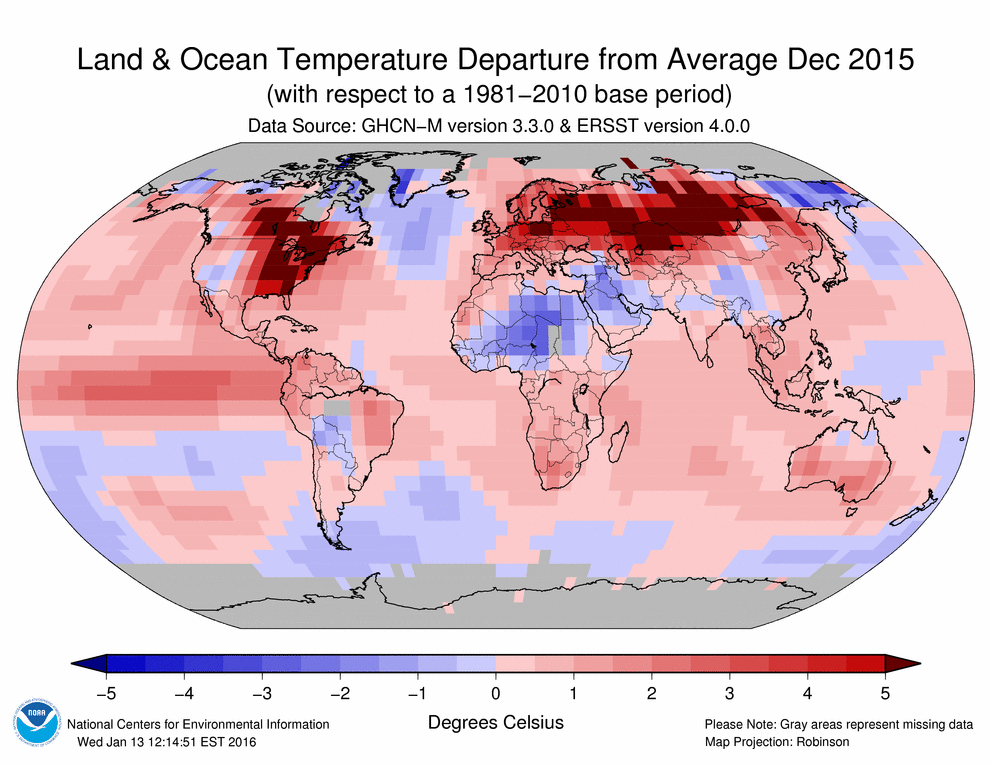
Then we aggregate daily Tmax to get monthly Tmax, and compare that with the average monthly Tmax from 1980-2015 to determine if, for example December 2015 was anomalously warmer than average. On to the details:
Algorithm
Prior to operationalizing the IRTmax process, we were working in the western US because the dataset is so rich. There we noticed some years where the geo-registration could be off by quite a bit. Most noticeably with B1 version 1 data, but B1 version 2 data still occasionally had some variability in pixel location on the order of a few pixels. This is an issue for land areas next to water bodies for instance, or in areas of high topographic relief. We decided to avoid years, 1980, 1981, 1983, 1989, 1990, 1991, 1992, 1993, 1994 and 1995 for calculating the climatologies.
There are 25 good years left between 1982 and 2014.
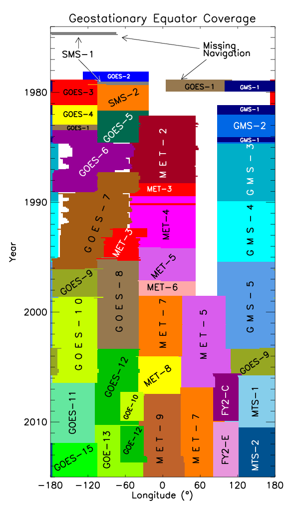
The attached figure shows the various Geostationary sensors in use over the equator. The 1989-1995 time period for the western US coincides with the GOES-7 period when there was only a single GOES for the US, so it had to cover both coasts.
This should have no bearing on Africa which has consistent satellite coverage, just wanted you to know why we selected these 25 years to make a climatology.
Start by making climatologies of expected brightness temperature for each pixel for each month, 8 times a day.
at each pixel, get all of the data over a calendar month, Eight times a day, using a 5x5 array centered on the pixel over 25 good years.
The first cut is to exclude any data points colder than 180 K or warmer than 340 K, this is just bad data.
Look at the histogram of all data points (binned every 3 degrees to avoid spurious maxima) for each of the 8 hours/months. The goal is figure out a mathematical way to trim the high and low outliers so that we are identifying actual anomalies from actual data rather than identifying cloudiness or misregistration or sensor calibration errors, etc. A histogram of all of the temperatures for a given pixel for a given month for a given hour will have a really long tail on the low end, and then a near gaussian distribution of good temperatures at the high end. the low end is all of the solidly cloudy to partly cloudy data values. The first cut at this was to fit a gaussian to the entire distribution (which was dominated by the gaussian good values) and only keep values +/- 3 standard deviations from the mean. This worked fine for Africa, where generally the amount of good values is >> the amount of cloudy values. For the western US, especially in winter, the overall distributions become distinctly non-gaussian, because there are so many cloudy data points. The second cut at this seeks to isolate the good part of the distribution by uncovering the gaussian portion of the distribution through proxy. We find the upper threshold (a proxy for SD +3) and peak of the gaussian part (proxy for center/mean of the histogram) and then calculate the lower threshold (SD -3) assuming a symmetric distribution as (center - (thresh High - center)).
- we find the peak/center by looking for the first local maxima when you start looking from the right side of the distribution. we do this because there can be bimodal distributions with the lower temperature peak being the erroneous one.
- to find the +3 S.D. upper threshold we calculate the 99th percentile of the entire distribution. There are some tricks here. you have to trim erroneous high values before calculating the 99th or else you can have a really high upper threshold. We isolate the true end of the histogram by looking for bins having >10 counts in them (4 in a row) then 2 bins with counts of zero. In the cloudy tail there can be bins with values then no values, then values again, so if there are multiple instances of the xxxxoo pattern we take the higher instance. This works fine for most of the world. When Pete ran the code on the world from 70N to 70S it broke down in Siberia, Greenland, Antarctica. The fix is: if no xxxxoo then allow xxxxo. if not that, allow xxxxoo where x just has to be >0 rather than >10. The amount of good. non-cloudy, data at high latitudes can be minuscule.
So we end up with a symmetric, gaussian-like distribution of good temperature values. getting the clouds out is incredibly important, obviously, and this works pretty well.
For each 3 hour period for each month we are left with a 4 dimensional array: 31 days x 25 years x 5 x 5
- take the maximum over the 5x5 neighborhoods, then the median over 25 years, then the median over all days in the month. This results in 8 maps (at 00, 03, 06, 09, 12 ,15, 18 and 21 hours) representing the 25 year average Temperatures, for each month (clim)
- for each pixel, calculate the maximum of the 8 clim maps, maxclim. The timing of the heat of the day depends on longitude.
- Now we go back to the daily data. for each of the 8 obs/day take an anomaly, Tb(h) - clim(h)
- take the maximum of the 8 anomalies over the day, maxanom
- add these two together to get IRTmax for the day: IRTmax = maxclim + maxanom.
- for each month, daily IRTmax are averaged, and then we calculate the average over all years (1980-2015), monthly IRTmax
- we subtract the overall avg monthly Tmax from each of the monthly Tmax to determine anomalies, whether a given month within a given year differs from the long term average for that month
Fixes to make
one of the first steps in the process involves generating a histogram, per-pixel, of all of the Tb values through time. then we identify erroneous high values that would lead to a higher than correct upper threshold. the first way we did this was to locate the end of the real histogram by finding 4 good values (bins with a count >10) in a row followed by two zeroes for the next bins. this breaks down in Siberia/Greenland/Antarctica and if the xxxxoo search string isn't found the histogram isn't modified, leaving some weird erroneous data points. I added 2 if statements to clarify things. if no xxxx00 then allow xxxxo. if not that, allow xxxxoo where x just has to be >0 rather than >10.
somehow record how many cloudy days (hours) were thrown out to get the temp value for a pixel for a month. use this to quantify uncertainty. i.e. december -- El Nino US west coast, India
Validation
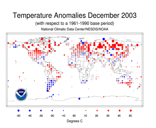
some useful websites: https://www.ncdc.noaa.gov/sotc/global/200312 (change the year/month in the path) this has nice global maps of temp anomalies from GHCN station data. For 2000- 2011 these are point maps, for 2012-2015 they are gridded. Examples:
climatespy.com is a really nice website with long term data for the US so you can easily get an idea if a month is anomalous or not. the stations per state are a little limited, though http://www.climatespy.com.fqdns.net/places/dir/united-states
USclimatedata.com is useful for smaller cities
things we are missing (december): we don't seem to be able to predict trends in India. also, el nino/la nina on the west coast and in the cascades/sierras seems to be an issue (i.e. rain 26 days in a month in places) = no cloud-free data.
could also download the data used to make the NCDC maps: http://www.esrl.noaa.gov/psd/data/gridded/data.gistemp.html
The '1200km smoothed' datasets have fewer grid cells with missing data than the '250km smoothed' One-Line Description: Goddard Institute for Space Studies (GISS) surface temperature analysis for the globe. Temporal Coverage: Monthly anomalies 1880/01 to present (NASA uses 1951-1980 base period). Spatial Coverage: 2.0 degree latitude x 2.0 degree longitude global grid (360x180). 89.0N - 80.0S, 1.0E - 359.5E
Oz validation http://www.bom.gov.au/climate/averages/tables/cw_015590.shtml [Alice Springs] really nice, you can make avg plots, then add a year. temp, # days w/ rain are good variables http://www.bom.gov.au/climate/averages/tables/cw_014015.shtml [Darwin]
where code resides in Linux
Hi Seth,
My idl code for IRTmax lives here,
/home/source/pete/IRT/seth-tmax
The month cubes by hour live here,
/home/sandbox3/B1-GridSat/tifs/monthcubes/
IRTmax daily GeoTiffs, (1/2 Tb)
/home/sandbox3/B1-GridSat/tifs/adjTmax.daily
IRTmax monthly Geotiffs,
/home/IRT/Tmax/monthly
with subdirs,
                 /africa
                 /anom
various IRTmax pngs, (stdev, counts, more to come.....)
/home/IRT/pngs/monthlyIRTmax
There you have it.
Take care,
-pete


